EN
EN
 English
 日本語
日本語 Español
 Deutsch
 عربى
عربى
Food packaging bags not only serve to package and protect food, but also reflect the characteristics of the food. The manifestation of these characteristics is mainly achieved through the analysis of the characteristics of the target audience, which is transformed into patterns and text. Thus, certain requirements are placed on the color and font of food packaging bags.
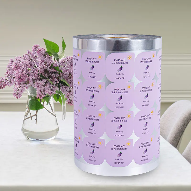
One: Harmony and unity
When designing patterns and text on different food packaging, the patterns and text on the packaging bags, as well as the background design, must all follow the principle of "harmony and unity". The font of the text should not exceed two types, and generally the same font is used. For highlighting and other purposes, a second font may be adopted. The background color of the overall pattern is recommended to be white or full color. Better highlight the content, attract consumers' purchases, and guide users' usage.
Two: Fully demonstrate
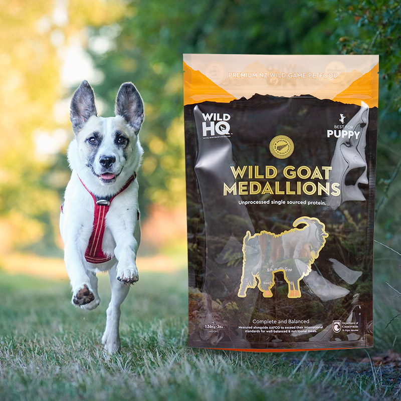
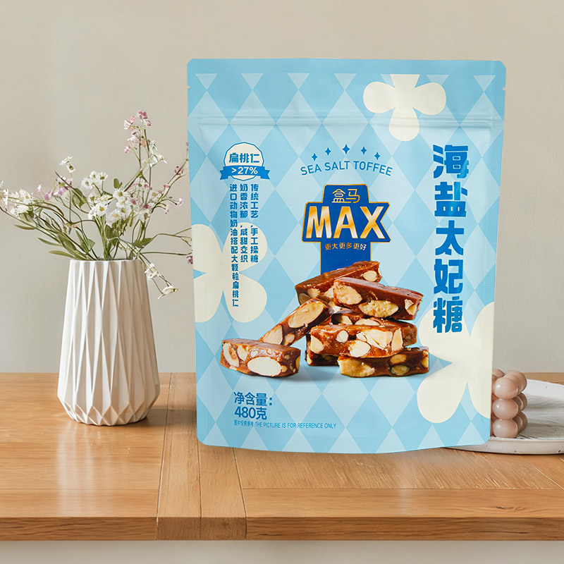
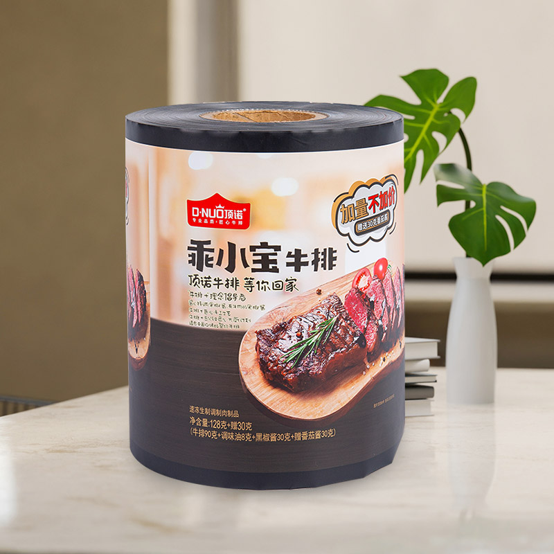
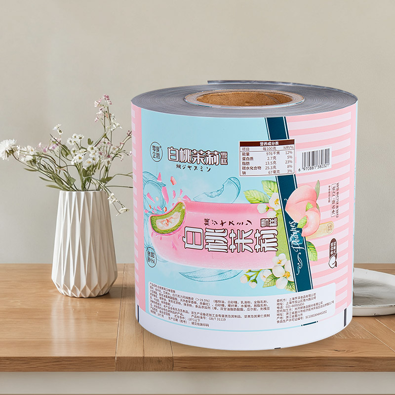
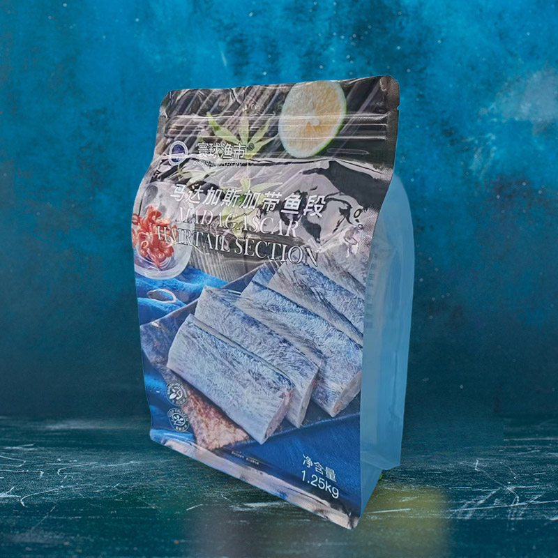
The colors and fonts on food packaging bags are mainly used to showcase the features of the products and attract consumers to purchase. So, how can we fully display them? Firstly, vivid and realistic product images can be used for presentation, transforming the abstract into the concrete. For instance, pictures of the planting scenes in the place of origin or plant products can be adopted. This form of presentation is intuitive and clear at a glance. It not only plays a guiding role in consumption but also serves to explain and clarify, avoiding subsequent disputes and controversies that could bring negative controversies to the product. Secondly, it is necessary to directly indicate the nature of the food, using standardized food names instead of self-compiled ambiguous words. For instance, among the various "pie" type snacks we often see, if you observe carefully, you will find that the words "filled cake" are marked on the packaging bag.
Three: All that should be detailed must be detailed
The Ministry of Health has strict requirements for the text on food packaging in some specific contents. In terms of printing, it is necessary to strictly follow the requirements for design and printing. The printing fonts, font sizes, and colors used should be uniform. Where details are needed, such as relevant textual descriptions about the product, they must be detailed as required.
Four: The same color scheme and design for products in the same series
Regarding the color of packaging bags, the image color of the product is generally adopted. By using a large area of image color, the positioning, attributes and features of the product can be quickly conveyed to consumers. For instance, organic food usually uses green as the base color. To stimulate consumers' desire to purchase and consume, colors such as red and white are commonly adopted in the food industry. Then for the same series of products, uniform specifications, designs, specifications and color tones should be adopted to build a unified product image in the minds of consumers.